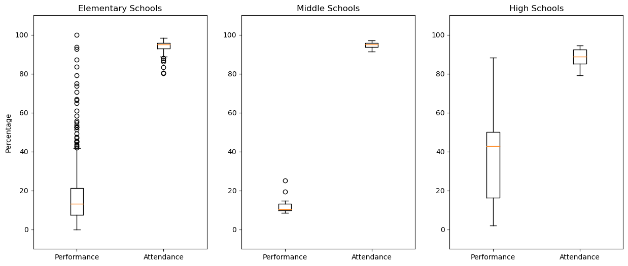
Performance and Attendance across School Levels

In this visualization, we compare performance and attendance values from across the three levels of schools. The first insight that we gain from this is that all schools are relatively well-attended with each maintaining an average student attendance above 90%. Our second insight focuses on the performance scores. With the given schools in our data set, the high school box has a much greater dispersion than the other two and has the highest third quartile of the three, showing that the high schools in Chicago tend to have better scores than the other two. Our third insight from this data is that middle schools are both the lowest performing and highest attended based on the box plots. Middle school attendance is similar to those of the other two levels of schooling, but the performance scores are much lower. The Chicago school system might need to focus on middle schools more than the other two in order to improve performance scores.
Freshmen on Track
This visualization focuses on the percentage of freshmen that are on track with their grade level in Chicago public high schools. Both the 2011 and 2013 data sets are used here, and the low number of data points is due to there being few high schools represented in the 2011 data. One insight is that teacher attendance doesn't seem to be a good indicator of whether freshmen are on track. For 2012, the data points seem to be dispersed without any regard for teacher attendance as lower levels of teacher attendance have higher rates of freshmen on track than higher levels. Another insight that we gained from the data is that the amount of freshmen on track does not seem to improve with time. Across the three year time frame, the values remain dispersed with some decreasing and others increasing. If time was a major factor, then we would see values trending in a specific direction as the time frame moves from 2011 to 2013. A third insight that we gained from the data was how far apart some schools were from others in terms of the percentage of freshmen on track. For example when looking at the data in 2012, one school had around 44% of their freshmen class on track while another had 97%. This demonstrates sizable differences between public high schools in the Chicago area.
College Enrollment by ACT Score
In this visualization, we used the 2013 data to analyze the relationship between ACT scores and college enrollment. The first insight that we got from this data is that college enrollment is positively related with average ACT score. As one increases, the other one increases as well. An interesting insight related to this is that the relationship between college enrollment and ACT score seems to be exponential and not linear. Schools that have about 90% of their students moving onto college have much higher average ACT scores (26-30) than those with 70% of their graduating class enrolling in college (16-20). Another insight is that growth rate in ACT scores is seemingly unrelated to average ACT scores. The growth rate is demonstrated by the size of the data point. There are many large and small data points grouped together, indicating that schools with varying growth rates have similar ACT scores. A final insight that we got from this data is that the average ACT score across Chicago public high schools is within the range 14 to 20 with a majority of schools falling within this range.